
Portfolio

Metro Credit Union
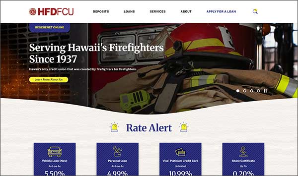
Website RedesignMetro Credit Union approached us with a clear vision: they wanted a fresh, clean look for their website that emphasized clarity and simplicity. Their previous site felt cluttered and overwhelming, making it difficult for users to navigate. Our challenge was to create a streamlined design that not only looked modern but also delivered an intuitive user experience.
We started by adopting a minimalist design approach, using ample white space and a balanced color palette to create a sense of openness. Typography was carefully selected for readability and visual harmony, ensuring that content feels approachable and professional.
To drive engagement, we implemented prominent, visually distinct call-to-action (CTA) buttons throughout the site. These buttons were strategically placed in high-visibility areas, guiding users toward key actions such as opening an account, applying for a loan, or contacting support. Each CTA uses concise, action-oriented language to eliminate confusion.
We eliminated unnecessary elements and consolidated information to avoid overwhelming visitors. By prioritizing content hierarchy and using consistent design patterns, the site now feels organized and easy to scan.
The result is a modern, user-friendly website that reflects the client’s brand values while delivering a seamless experience for their members. It was a pleasure collaborating on this project, and we’re excited about the opportunity to partner with Metro Credit Union again in the future!
Recent Projects
Honolulu Fire Department FCU

RedRiver Federal Credit Union

Educational Employees Credit Union